Let’s Roam
A 48-hour take-home redesign of a scavenger-hunt app's main hunt screen — the screen players spend most of a walking tour looking at. Research, a design critique, a working interactive demo, and full QA, built with a 5-agent AI-assisted workflow.
- Type
- Take-home exercise
- Role
- Growth Product Engineer application
- Timeframe
- 48 hours
- Delivered
- Research · demo · QA
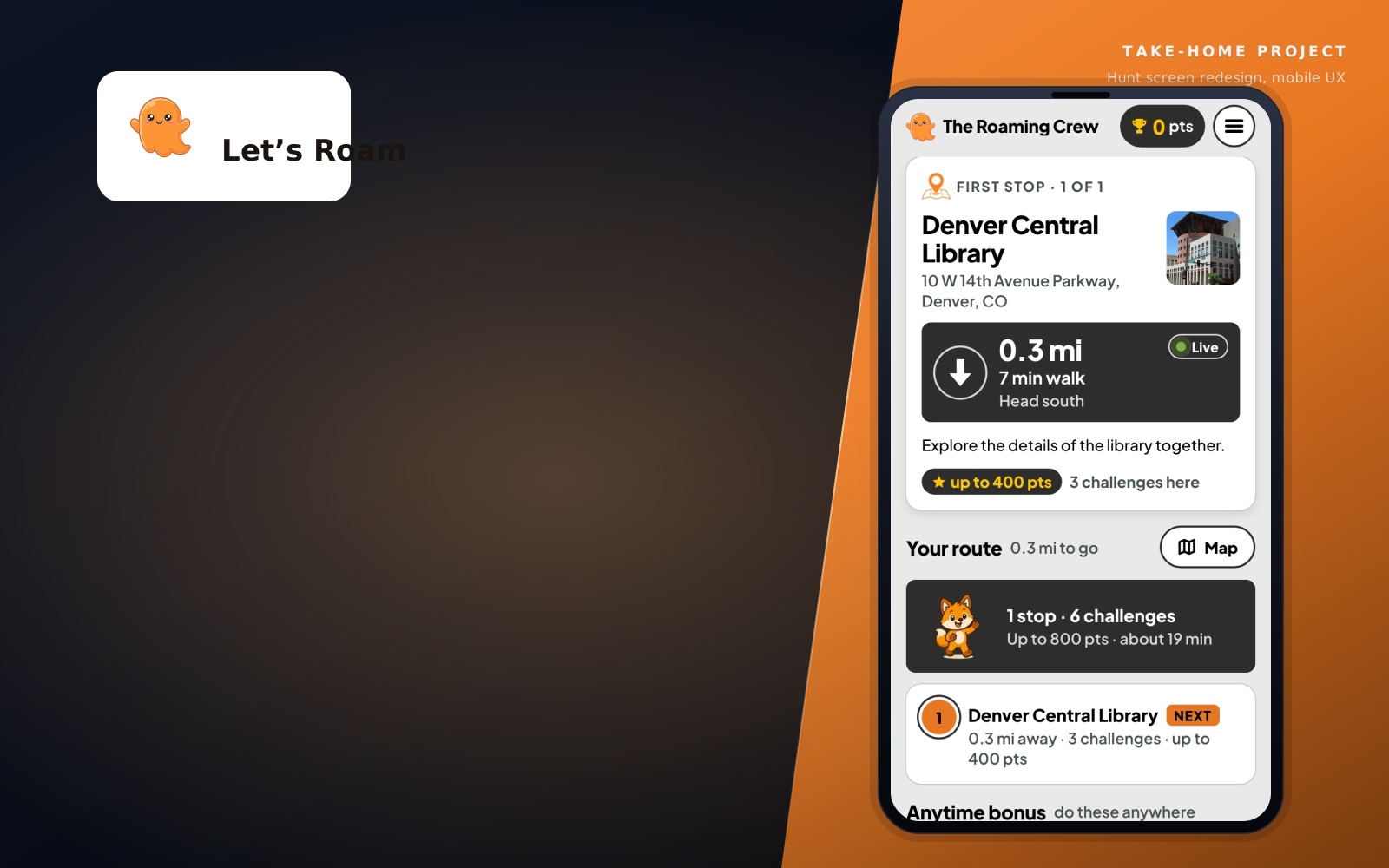
One screen, six real problems.
The brief asked for one thing: redesign the main hunt screen to raise completion, make the hunt more fun, and make it easier to understand — without touching anything else in the product.
The existing screen showed status (an empty progress ring, a scoring legend, a list of stops) but never answered the one question a walker actually has, glancing at their phone for a second at a time, often one-handed, in sun or after dark: where do I go next?
Six specific problems came out of a structured critique against the brief's own goals, backed by a pass of competitor and user-review research — hidden route order, no live distance or direction, every task type looking the same, illegible white-on-photo distance text, unclear point values, and a crowded header.
“Showed us all the different places, but not how to get to any of those places.”
— a real review, cited in the competitive research pass that grounded the critique
Same layout, every state covered.
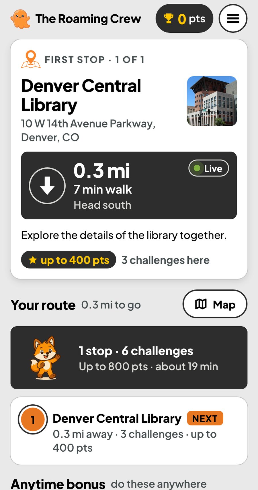
Day mode
The redesign’s core: a single Next Stop card up top with live distance, a bearing arrow and one primary action, then an always-visible numbered route underneath.
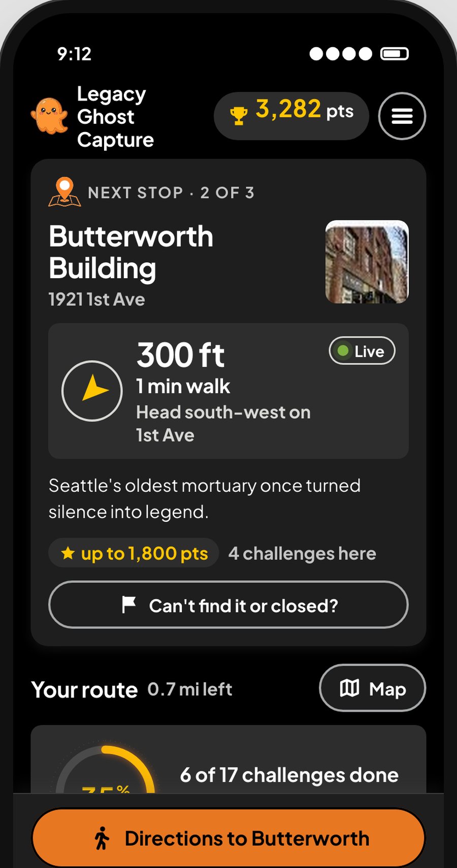
Night mode
Ghost tours run after dark. An automatic night theme ships with the exact same layout, not a separate design to maintain.
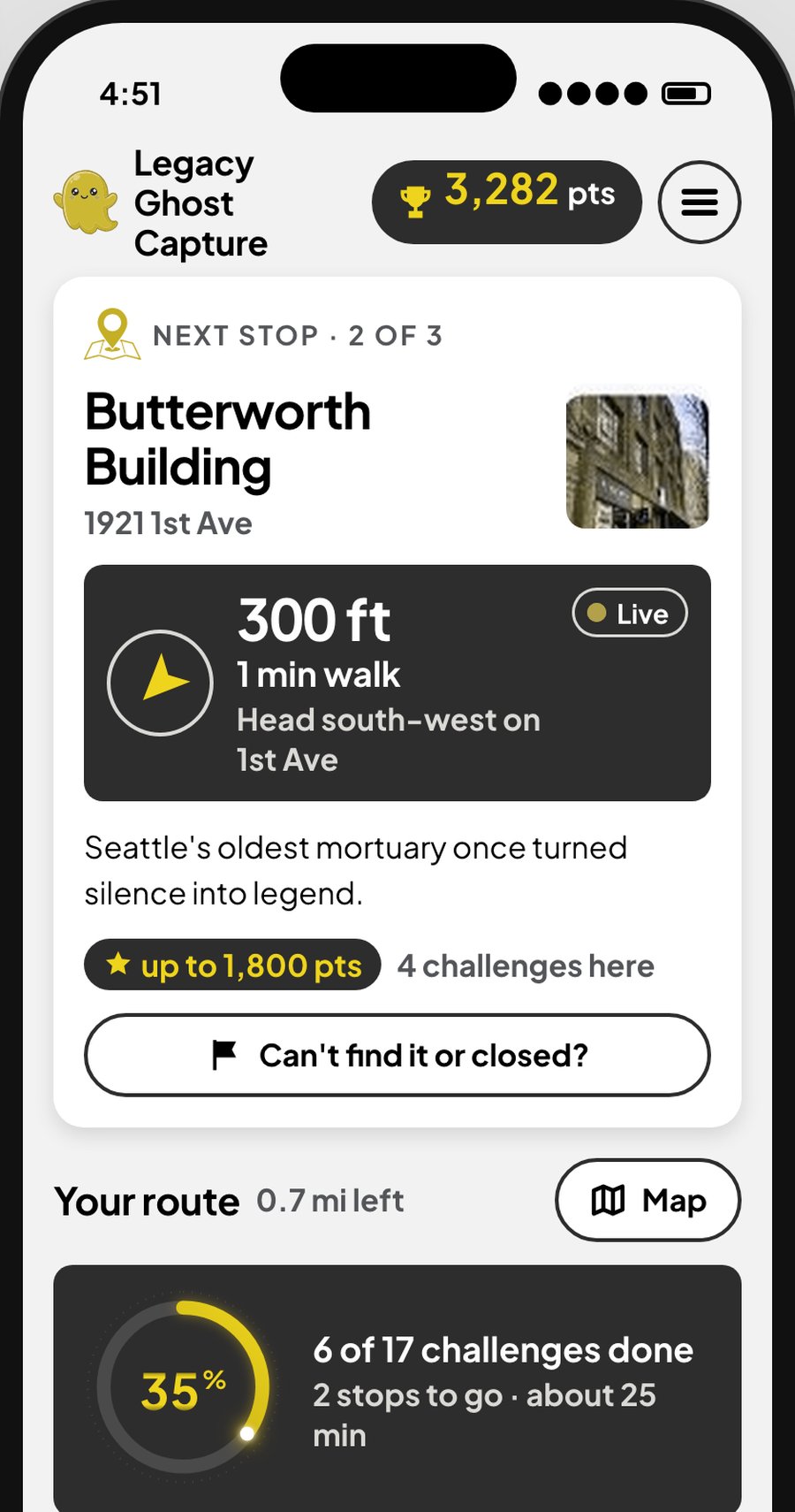
Deuteranopia simulation
Every state (done / next / later, live / stale GPS) is carried by icon and label, not colour alone — verified against protanopia, deuteranopia and tritanopia simulations, not just eyeballed.
Not just a mockup.
Working, not mocked
A real interactive demo — double-click and it runs offline, no install or build step. Served over HTTPS on a phone, it uses real GPS.
Cross-browser QA
Verified in Chromium, Firefox and WebKit: day/night, reduced motion, 200% text zoom, stale and offline GPS, and every stage of a hunt from not-started to complete.
Accessibility checked, not assumed
Protanopia, deuteranopia and tritanopia simulations run against the real screens, plus keyboard focus order and a verified contrast fix on the brand’s own orange CTA.
Research-grounded
A competitive pass across similar apps’ own user reviews shaped every recommendation in the critique — not personal taste.
Built with a 5-agent AI pipeline
Researcher → designer → UI dev → data/logic dev → QA, each writing to their own part of the project, bugs routed back to the right owner. The brief asked for the full conversation transcript as its own deliverable — it shipped as one, unedited.
Tools used.
Keep exploring.
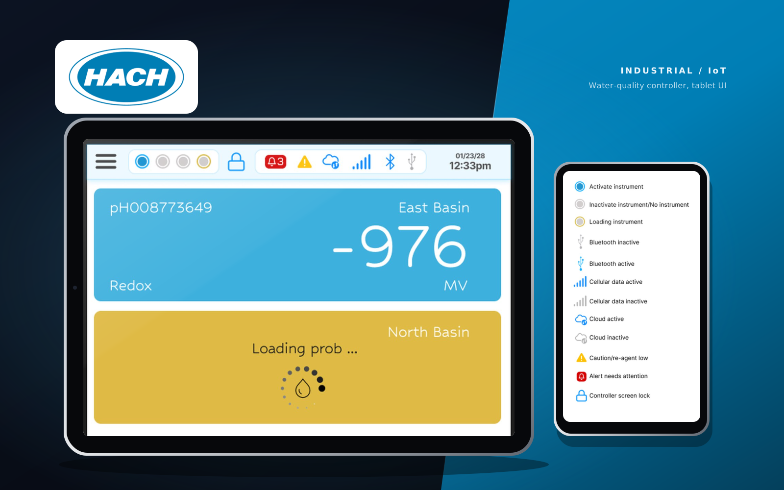
Hach Controller
A tablet interface for a water-quality instrument: big readings, clear status, one small icon system.
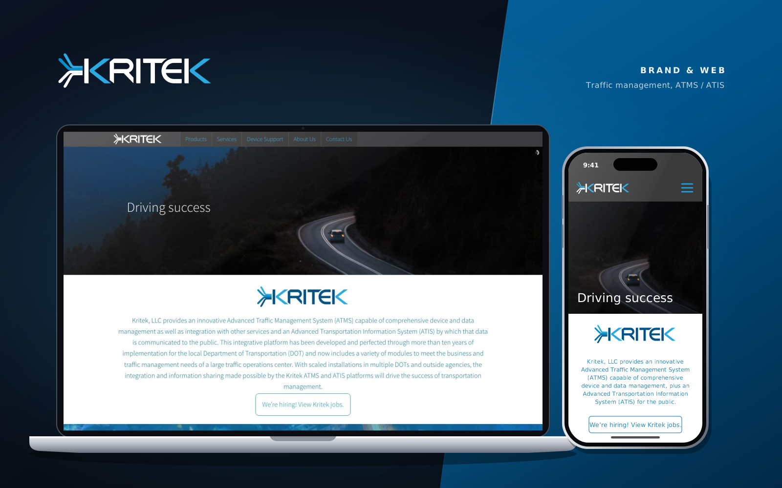
Kritek LLC
A brand mark, a 67-icon library, and six shipped pages for an IT consulting firm serving transportation agencies.
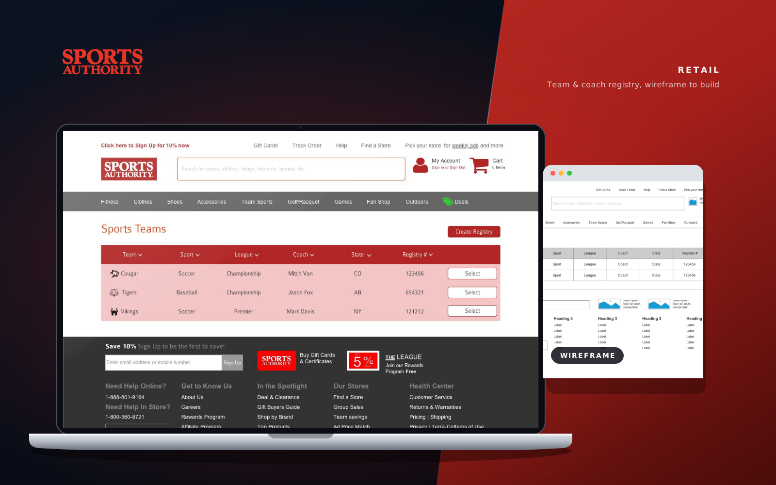
Sports Authority
A team and coach registry taken from a low-fi Axure wireframe to a finished, on-brand interface.
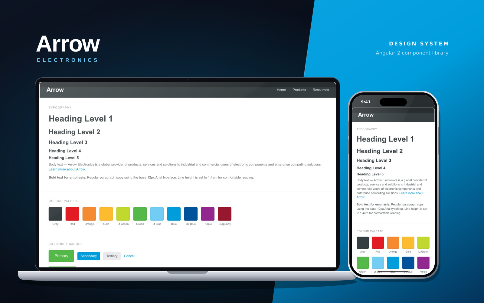
Arrow Electronics
Snap, an Angular 2 component library of design tokens and UI components for Arrow Electronics.